 |
 |
 |
 |
 |
 |

![]()
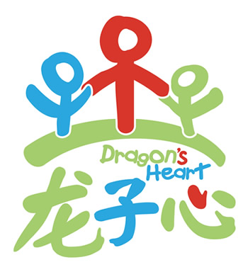
The Dragon’s Heart logo was personally designed by Jackie Chan and consists of several elements which together signify the true spirit of Jackie’s Dragon’s Heart Foundation charity. The colors in the logo all have meaning: Blue represents the sky, green represents the land, and red stands for the heart. In addition, the blue figure at the top represents the pure heart of a child. The larger red figure represents Chinese people. The green figure represents all children. The three are standing atop the green land and together with the Chinese characters at the bottom of the design, the figures and colors combine to represent the love and care that Jackie has for all children.
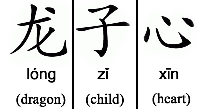
Here are the Chinese characters, the Chinese pinyin, and the English translation of Dragon's Heart:
long zi xin is pronounced like this: "long" is pronounced much the same as the word "long" in English, but has a rising tone, which means you say it as though you were asking a question: long? The z in "zi" is pronounced like the last two letters in the word "kids." The i is pronounced like the i in the word "first" or "shirt." The tone rises, falls, and rises again. "xin" is pronounced like the word "sheen" and has a high level tone (it doesn't rise or fall).
|
If you'd like to make any size donation online, please click here and choose "Dragon's Heart Foundation" from the drop down menu.
KIDS CORNER FRONT PAGE / LATEST JACKIE NEWS / TOTALLY FUN JACKIE STUFF / OFFICIAL SITE HOME PAGE
©2006 The JC Group
No part of this website may be reproduced or distributed without permission.